March 31, 2016

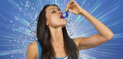
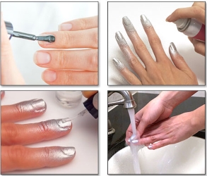
Spray Perfect & Nail Breeze

Spray Perfect

Main Pitch: "The spray-on nail polish that gives you perfect, polished salon-looking nails"
Main Offer: $19.99 for a can in choice of seven colors
Bonus: 2nd can/color, base & top coat (free)
Starring: Taylor Baldwin
Marketer: Top Dog
Producer: Hutton-Miller
Watch the spot

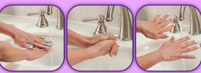
Nail Breeze

Main Pitch: "The amazing new airbrush polish that's totally brushless so you get salon-perfect results"
Main Offer: $10 for a can in pink
Bonus: 2nd can in silver (separate fee), base & top coat (free)
Marketer: Telebrands
Producer: Blue Moon
Watch the spot

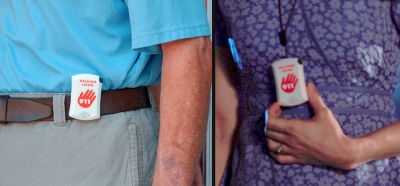
Helping Hand 911

Description: A personal panic button
Main Pitch: "With the simple push of the red hand button, you will instantly talk to a 911 operator anywhere, any time"
Main Offer: $39.99 for one
Bonus: Belt clip, lanyard
Marketer: Telebrands
Watch the spot

"I've fallen, and I can't get up!" That phrase, which comes from a late-80s Life Call/Life Alert commercial, is one of the most well known in TV history. Calling the item Old Gold would be a huge understatement. It's at least Old Platinum. Now Telebrands not only wants to resurrect the idea, but it wants to do it by trashing the original concept ... I like it.

To clarify, I like it from a marketing standpoint. I have no idea if the project is actually executable. About that I have my doubts. There are also liability concerns. For one thing, the QC better be excellent. "Send it back for a full refund of the purchase price" isn't going to cut it here. I also wonder whether making it so easy to contact emergency services is a good idea. But these concerns are beyond my area of expertise.

S7 Analysis: Going down the checklist, the only place I paused was the targeted criterion. This commercial features a middle-age cyclist, but that's far-fetched. Watching the original Life Alert commercials, it's clear who the target customer is: Older seniors who use canes and walkers. That makes me wonder if the product is too senior to sustain a campaign without the ongoing subscription revenue that supported the original business.

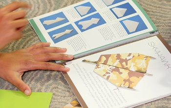
Paper Plane Palooza

Description: A kit for building paper airplanes
Main Pitch: "New action kit ... makes, shapes, and creates the best paper planes"
Main Offer: $10 for one kit with 25 designs and 50 sheets of paper
Bonus: 50 more sheets of paper (free)
Marketer: Telebrands
Producer: The Schwartz Group
Watch the spot

Maybe it's just me, but this seems like it would only appeal to the same niche market that thinks Origami is cool. For most kids, about the cheapest and easiest thing you can do when you're bored is fold random pieces of paper into an airplane. Making it complicated with special paper and fancy folding techniques kinda defeats the purpose.

I also wonder whether today's kids have ever even made a paper airplane? When they're bored, don't they just grab an iSomething and start playing games? And if they love airplanes, isn't there an app for that?

Weekly Round-Up

  1. Mattress Door Busters. Starring: Brian Hyder. Marketer: Tristar. Pitch: "Premium, top-of-the-line mattresses up to 75 percent off"." Comments: Tristar continues to experiment with new business models. Check out Was On TV and Doggy Bonanza Express if you're interested in reviewing some of their other experiments. I admire the ambition, but I wonder if a DRTV company is capable of operating ambidextrously. Based on my experiences and observations, it's hard enough to properly execute one business model. [ss]
  2.  
  3. Chirpee. Marketer: Lenfest. Producer: Hutton-Miller. Pitch: "Listens in on birds while they sing and feed on the outside, then he repeats everything so you can hear it on the inside." Comments: This is sort of a cross between Lenfest's My Spy Birdhouse pitch and Telebrands' Perfect Polly. It's definitely different, but it's also an odd item to try on DRTV. [ss]
  4.  
  5. Cuddle Up Playhouse. Pitch: "It's a blanket! It's a house! Plus a whole lot more." Comments: Just when you thought the industry had finally stopped imitating Pillow Pets ... Or is this an attempt at Old Gold just four years later? Design-wise, this is actually closer to Happy Nappers. [ss]
  6.  
  7. Micro Zoom. Marketer: Allstar. Producer: Paddock. Pitch: "Lets you turn any phone or tablet into a 30X digital microscope." Comments: Written by yours truly. [ss]

March 24, 2016

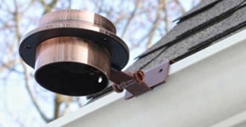
Copper Solar Top Light

Description: A solar-powered outdoor light
Main Pitch: "The wireless self-charging copper light that turns on at night"
Main Offer: $12.99 for one
Bonus: 2nd one (just pay a separate fee)
Marketer: Telebrands
Producer: Kerrmercials
Watch the spot

The copper craze has passed the point of absurdity. I'm a bit embarrassed for our industry, actually. Are we so simplistic in our thinking that we can't separate the core of what makes something a hit from the superficial aspects that obviously had nothing to do with it? Put another way, do people in our business really think that simply adding a word from the brand name of a hit to any old project is going to have a positive impact on its CPO?

I don't mean to single out Telebrands. What happened here is that they tried a product called Solar Top Light in 2012 that didn't roll out. We can assume it was close and maybe just needed something to push it over the edge. It's now four years later, and copper is a huge trend, so they took a shot on a copper version. It's not a brilliant idea, but it's not the dumbest idea I've heard, either.

Besides, the commercial isn't implying this light has the same magical properties as Tommie Copper. Copper is simply the finish, and it's a good look for a light. At minimum, it doesn't hurt the pitch. The same can't always be said of the other copper items I've been reviewing lately. For example, to borrow a quip from a friend, a copper pan just seems like a good way to make your food taste like pennies.

S7 Analysis: Moving past the copper issue, lighting is a tricky category. Whenever I run an S7 analysis on any such item, it tends to fare well -- and this project is no different. Yet I know from the checkered history of the category that it deserves its spot on my 'bad categories' list. I really can't explain the discrepancy. I guess every checklist has its limitations.
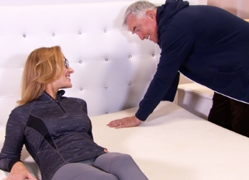
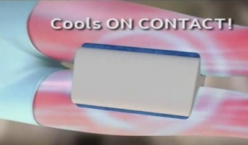
Clever Cool

Description: A cooling knee pillow
Main Pitch: "Improves your body's natural alignment and gives you a more comfortable, cooler sleeping surface"
Main Offer: $14.99 for one with cover
Bonus: 2nd one (just pay P&H)
Marketer: Allstar
Producer: Opfer
Watch the spot

The knee pillow is a classic example of Old Gold turned Siren. It happens sometimes. The market changes, an old item fails to resurrect once or twice, and yet marketers still hold onto the hope that they can figure out how to bring it back.

In this case, the Old Gold item is the Contour Leg & Knee Pillow, which was on the charts from 1999-2002, topping out at No. 1 in 2000. That's a nice shiny piece of gold, so I get it. But here's what has happened since then ...

  1. Simon Right tried the Ultimate Knee Pillow
  2.  
  3. Ontel tried the same commercial under the name Huggy Knee Pillow
  4.  
  5. National Express tried the Sobakawa Knee Pillow
  6.  
  7. And Contour itself tried with Double Back

What's interesting is that all of those attempts featured 'new and improved' versions of the original concept. I suppose it's possible that the knee-pillow concept can still make a comeback, it's just that no one has found the right angle yet. (Hear the Siren calling?) But I'm not sure cooling is the thing. At least, the idea struck me as strange when I first considered it. Do sleep pain and sweaty thighs go together? Maybe solving the former problem creates the latter problem? I can't really say, but this feels like the old 'segment of a segment' thing again.

S7 Analysis: In S7 language, my issue is with the target. I think focusing the pitch in this way might be slicing the market too thin to support a campaign.

Wonder Ears

Description: Sound-amplifying headphones
Main Pitch: "Helps you hear so everything is clear"
Main Offer: $19.99 for one
Bonus: Clear TV key (just pay P&H)
Starring: Brian Hyder
Marketer: Tristar
Watch the spot

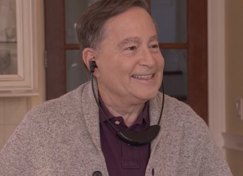
This is a cross between MyZone Headphones (2012) and Listen Up (2007), Loud 'N Clear (2009) and several other hit sound amplifiers from years past. That is to say, there's a strong category history here. Yet I'm still not loving this project.

The issue for me is the design, which I can tell was inspired by a regular seller called TV Ears. The issue is that design limits the functionality of the product. It really only works for watching TV (hence the name). The commercial tries to sell it as a portable sound amplifier as well, but the key to that pitch is to have the product be compact and discreet -- and this is anything but.

S7 Analysis: Even with its limitations, this product meets all of the important criteria for DRTV, especially in that it's targeted properly. Although I don't love it, I can see it rolling out -- especially since TV Ears' cheapest unit is still more than $100.

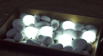
Luma Stone

Description: Tap lights that resemble stones
Main Pitch: "With a simple touch [they] provide you with the perfect amount of light"
Main Offer: $14.95 for two with holders
Bonus: Double the offer (free)
Marketer: IdeaVillage
Producer: Sullivan
Watch the spot

I've seen the inspiration for this product (which is more of an orb), and I remember liking it. I like what IdeaVillage has done with the idea even better. They've cleverly changed the product so that they could employ the old Tap Light (1999-2000) pitch, which also helped Ontel's Stick 'N Click (2006) and Telebrands' Stick Up Bulb (2006-2007) become successes.

It's fitting that the Sullivan team produced this commercial because they also produced all of those commercials. Actually, I think this is their best work yet, and it's because the new product design allowed them to give the creative that high-end 'spa' feel at which they excel.

Those are the positives. The negative is the category yet again. Lighting has not been kind to DRTV marketers in the years since 2007. This "stone" design is also best suited for the purse-light use, but the history has not been promising there , either. Off the top of my head, I can think of at least three purse lights that failed on DRTV (e.g. Light My Purse). There's also a tertiary pitch about this being a night light that can be carried, but that was also tried without success. I'm not one who thinks combining a winning concept with two losing concepts is advantageous.

S7 Analysis: A primary benefit of the "stone" design is that it's different, which is a good thing for cutting through the clutter but can also be polarizing. The 'hockey puck' design obviously works for people, and there's little risk in marketing something that looks like a light bulb. A stone, on the other hand, is more whimsical and kid-oriented, which could take it out of serious consideration for adults. Or not. It's just a guess. Like all lights, this fits the criteria pretty well otherwise.

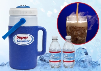
Super Cooler

Description: A cooler
Main Pitch: "Super cool your favorite beverages to below freezing"
Main Offer: $19.99 for one
Bonus: 2 ice accelators
Marketer: Tristar
Watch the spot

This one has me stumped. I watched the commercial and closely reviewed the Website, but I'm still confused (and confusion is a sales killer). Is this product just a really effective cooler? Or is there some sort of additional device involved that instantly chills drinks outside of the cooler? The commercial uses a recurring special effect, but I can't tell if that's meant to be a representation of an actual function of the product. On the Website, there's mention of something called an "ice accelerator," but it isn't clear what that might be.

Bottom line: People won't buy what they don't understand, so this is a major liability for the project.

S7 Analysis: Setting aside the confusion concern and the obvious issues around seasonality (which is not an S7 criterion), I'm still left wondering if an item like this is needed. Most of the problem/solution sequences in the commercial come across as highly contrived. For instance, why would a sports fan need a special cooler to serve his buddies cold beer at home? Couldn't he just think ahead and put some bottles in the freezer before they arrived? Etc.

March 17, 2016

Scan Blocker

Description: A card that protects credit cards
Main Pitch: "The tried and tested way to prevent electronic pick-pocketing"
Main Offer: $19.99 for one
Bonus: 2nd one (just pay P&H)
Marketer: Allstar
Watch the spot

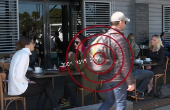
Years ago (circa 2011), Telebrands had a hit with a product called Aluma Wallet. One feature of said wallet was RFID-blocking technology. Since then, DR marketers have believed preventing electronic pick-pocketing (which is what RFID-blocking was all about) is a viable pitch. I’ve always thought it was a secondary pitch at best. The evidence has been hard to read.

On the one hand, there have been four attempts to market a sleeve that protects credit cards from this 'scourge.' On the other hand, Telebrands rolled out with the fourth attempt, called Card Lock, which became a 2015 True Top Spender. Last year, Ontel also had a True Top Spender called Lock Wallet, another RFID-blocking wallet. In the case, the RFID-blocking pitch was more primary – but it was still a good, functional wallet.

So where does that leave us? If we’re trying to establish that electronic pick-pocketing prevention is a category, we can piece together the three examples we need to support that case. But it’s by no means a slam dunk. This one is quite tricky.

S7 Analysis: It all comes down to the needed question. My feeling is that all of the focus on RFID has been a grand attempt to create a need where none previously existed. By now, perhaps, enough people know about the electronic pick-pocketing issue for RFID products to make sense. But does that mean they perceive a real need? If so, why would this commercial have to work so hard to inform and frighten people? Etc.

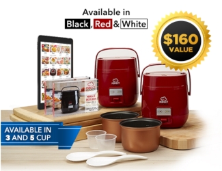
Perfect Cooker

Description: An electric pot
Main Pitch: "One touch, one pot, one perfect cooker"
Main Offer: 2 pay of $19.99 for one
Marketer: Tristar
Watch the spot

This is a great product and another reason for me to be excited. It combines the convenience of a slow cooker with the versatility of a cooking pot and it's portable. If there's a negative, it's the challenge of communicating so much in a two-minute format. It will be so much easier to explain this and build the pitch in long form and/or a live-shopping segment.

S7 Analysis: This one passes the S7 with flying colors. I could invent concerns, but they would all seem pretty minor.

Weekly Round-Up

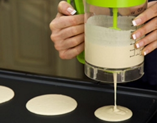
  1. Pancake Express. Marketer: Spark Innovators. Pitch: "Quickly measures, mixes and dispenses." Comments: There's some reason to believe DRTV buyers are interested in pancakes, but the successes have all been pans. In 2002, Merchant Media and a company called Allied dueled with a pancake pan (Perfect Pancake vs. Pancake Wizard), and in 2013 Allstar and Telebrands dueled with an updated version (Perfect Pancake II vs. Flip Jack). I tend to doubt people will be interested in an easier way to make pancake batter, though. It's already pretty easy, and the benefit of this gadget must be weighed against its cost -- in dollars and cabinet space. [ss]
  2.  
  3. Bubble Saucer. Pitch: "The amazing flying bubble machine." Comments: Looks like fun. Kids love bubbles and many like Frisbees. Not sure if they'll buy such a thing off TV, though. [ss]
  4.  
  5. Easy Carry Clip Shadz. Pitch: "Easily clip on to your prescription eyewear." Comments: This might have a shot under the HD Vision brand with a better commercial. As it is, it's not very exciting -- and it also faces the 'segment of a segment' issue. [ss]
  6.  
  7. Forever Wipers. Pitch: "Put a razor-sharp edge on dull wiper blades." Comments: This one's a tough read. Do people think of wiper blades in the literal sense? That is, do they think of them like razor blades and believe it's sharpness that matters? I don't think of them that way, but I've never asked around to find out what others think. [ss]
  8.  
  9. Garden Genie. Pitch: "The gardening gloves that let you dig and plant without hand tools" Comments: This seems like it's designed for hard-core gardeners, and that segment has proved difficult to target. In other words, the best gardening products for DRTV have spillover appeal to non-gardeners. [ss]
  10.  
  11. Glow Sharks. Pitch: "Turn your boring, ordinary bath water into a glow-in-the-dark tub party." Comments: Given the success of Party in the Tub and Shower Wow, there may be something here. Then again, it's only good for one use (like a glow stick), so that could be a barrier to purchase. Probably a good checkout item. [ss]
  12.  
  13. Sleep Sitting Up. Pitch: "Chin pillow was designed to provide comfortable sleep while sitting up." Comments: Truly bizarre. SNL couldn't do better. I'm sad it won't go far because I'd love to see the parodies and read the online comments! [ss]
  14.  
  15. Ultimate Jar Opener. Pitch: "Makes opening jars easy." Comments: Neat item, but probably too utilitarian. There's no real "wow." [ss]

March 16, 2016

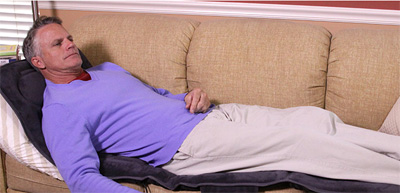
Recline & Unwind

Description: A 5-mode massaging pad
Main Pitch: "Turns any recliner into a spa"
Main Offer: $39.99 for one
Bonus: 2nd one (just pay a separate fee)
Marketer: Telebrands
Watch the spot

I'm excited about this project and several others I have been seeing. It seems people are committed to helping me answer a question I posed on the ERA blog at the end of last year: Is $40 the new $20? Thanks for the help, industry!

As for this particular product, it feels out of time to me. There was a period when massage chairs were all the rage. It may have been as far back as when Sharper Image was still in business. Stores like that one and rival Brookstone certainly used massaging devices as a big draw, especially during the holidays. And many DRTV marketers took that as a cue there might be an opportunity. But aside from the bizarre Air-O-Sage that Igia rolled out in 2003 (Telebrands also did it under the name Air Press Massager), I can't think of any noteworthy hits.

S7 Analysis: Perhaps in no small part because of the Sharper Image and Brookstone wars, I feel like massage is a crowded category. I also have doubts about the needed criterion. If people are going to spoil themselves, I tend to think they'll spring for the real deal. This seems like a half-measure.

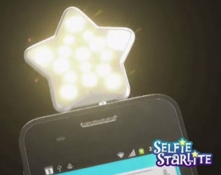
Selfie Starlite

Description: A star-shaped 'selfie' light
Main Pitch: "Gives you crisp, clear photos and videos every time"
Main Offer: $10 for one in white, one in black and pouch
Bonus: Double the offer, selfie stick (just pay a separate fee)
Marketer: Telebrands
Watch the spot

There has been no evidence so far that DRTV marketers can cash in on the 'selfie' trend. Believe me, I've tried. The reasons are fairly obvious in retrospect: The demographic is all wrong and the category (phone & tablet accessories) has the worst track record in our industry. This particular product also has a design that's bound to be polarizing. Some will think it's cute, others childish or silly. Do the calculation, and those are some pretty long odds.

S7 Analysis: Another way of saying 'wrong demo' is 'wrong target.' I'm also not sure how many people need better selfie lighting. Even for the most phone-obsessed teen, this seems like a problem that would be low on the scale. But I could be wrong about that. Teens could think it's positively devastating that their selfies are so dark. I wouldn't really know without some further research.

SciMark Report from March Response

My SciMark Report in print for March is now available on the Response Website.

In this month's issue, instead of writing about duels, I cover three marketers doing their own thing: IdeaVillage with Flexi-Frisbee, Telebrands with Fresh Pops and Tristar with the Perfect Posture Bra.