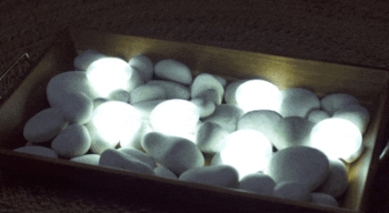
Description: Tap lights that resemble stones
Main Pitch: "With a simple touch [they] provide you with the perfect amount of light"
Main Offer: $14.95 for two with holders
Bonus: Double the offer (free)
Marketer: IdeaVillage
Producer: Sullivan
Watch the spot
I've seen the inspiration for this product (which is more of an orb), and I remember liking it. I like what IdeaVillage has done with the idea even better. They've cleverly changed the product so that they could employ the old Tap Light (1999-2000) pitch, which also helped Ontel's Stick 'N Click (2006) and Telebrands' Stick Up Bulb (2006-2007) become successes.
It's fitting that the Sullivan team produced this commercial because they also produced all of those commercials. Actually, I think this is their best work yet, and it's because the new product design allowed them to give the creative that high-end 'spa' feel at which they excel.
Those are the positives. The negative is the category yet again. Lighting has not been kind to DRTV marketers in the years since 2007. This "stone" design is also best suited for the purse-light use, but the history has not been promising there , either. Off the top of my head, I can think of at least three purse lights that failed on DRTV (e.g. Light My Purse). There's also a tertiary pitch about this being a night light that can be carried, but that was also tried without success. I'm not one who thinks combining a winning concept with two losing concepts is advantageous.
S7 Analysis: A primary benefit of the "stone" design is that it's different, which is a good thing for cutting through the clutter but can also be polarizing. The 'hockey puck' design obviously works for people, and there's little risk in marketing something that looks like a light bulb. A stone, on the other hand, is more whimsical and kid-oriented, which could take it out of serious consideration for adults. Or not. It's just a guess. Like all lights, this fits the criteria pretty well otherwise.
